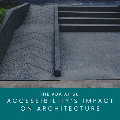
The ADA at 30: Accessability's Impact on Architecture
Published on July 22, 2020 by Nate Bortz

This year marks the 30th anniversary of the American's with Disabilities Act (ADA). During that time, architects and designers have helped improve the lives of people with disabilities around the country. But according to some industry leaders, there's still a lot more work to do.
Last week, architecture critic Michael Kimmelman wrote a piece that gathered examples of ways modern architecture has not yet fully embraced accessibility as a core part of design, but instead often sees it as an afterthought. Here are some highlights to reflect on as you continue to work on expanding your education.
Managing Priorities
As you personally start working on a design for a building or public space, where does your mind go first? The overall look? The way a person interacts with the space? Probably anywhere except how it will comply with codes like the ADA. Joel Sanders, a New York-based architect and Yale professor, says that Western architecture has largely catered toward a default user: people without disabilities. "Everyone else," Sanders says, "including those with mobility or cognitive issues, tends to become an afterthought, a constraint to creativity, an added cost."
One recent example of this trend is the 22,000-square-foot Hunters Point branch library in Queens, N.Y. Mr. Kimmelman himself wrote a positive review when it opened, stating its "soaring interior of vertiginous tiers and zigzagging stairs" made it "one of the most uplifting public buildings New York had produced in years."
However, much like the designers of the library before it was built, Mr. Kimmelman failed to consider the building's lack of accessibility when writing his review. The many stairs and tiers in the library made some parts unaccessible to anyone in a wheelchair. "How uplifting could a public library be if some people felt unwelcome?" said Mr. Kimmelman.
Since one in four American adults are living with a disability, Mr. Kimmelman argues that designing for accessibility should no longer be an afterthought, but a creative and economic opportunity during the original design stage.
Examples of Accessible and Beautiful Design
The Ed Robert Campus is a 80,000 sq. ft.transit-oriented campus located at the Ashby BART Station in Berkeley, California. It includes design elements such as a helical ramp leading to the second floor, specially designed signage and way-finding devices to guide people who are blind or have low vision, and hands-free sensors and timers control lighting, acoustical, and security systems.
Weiss/Manfredi, a New York architecture firm, designed the Brooklyn Botanic Garden's Robert W. Wilson Overlook with an "innovative switchback path that allows better access to the Garden for visitors of all abilities."
As you continue to hone your skills and evolve with your craft, consider working toward making designs that intentionally include everyone instead of working with a "default" in mind.
